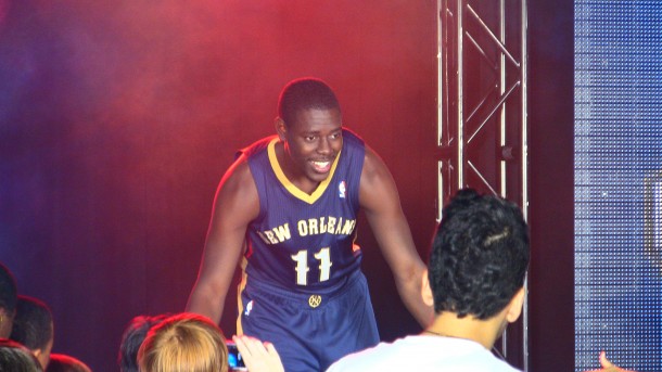
New Orleans Pelicans Uniforms Unveiled


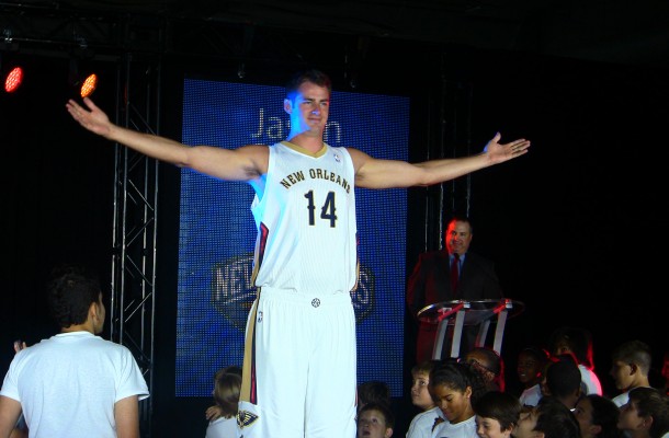
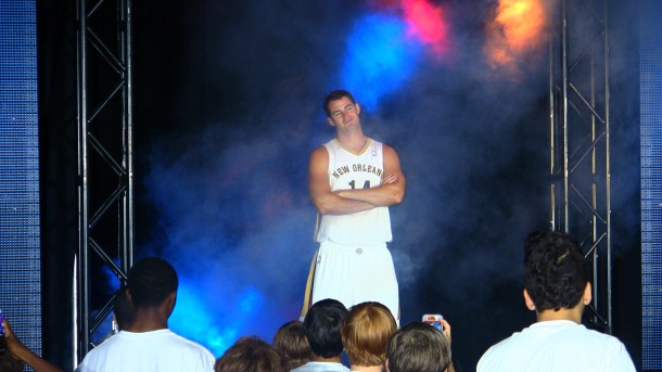
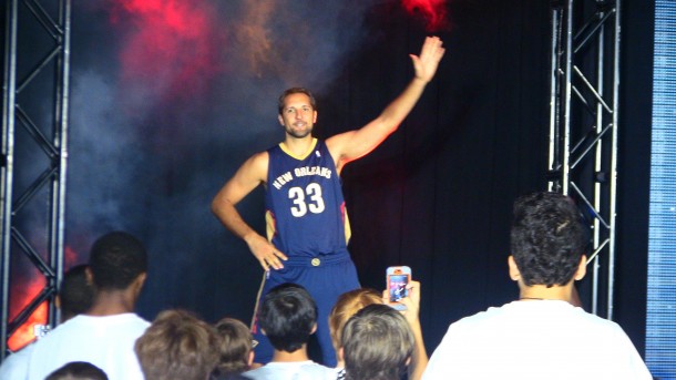
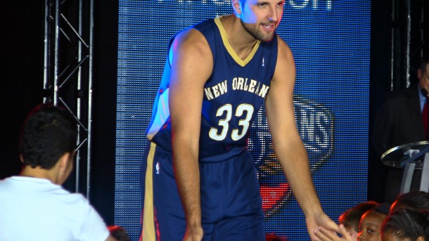
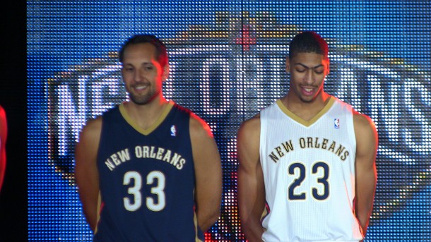
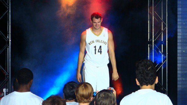
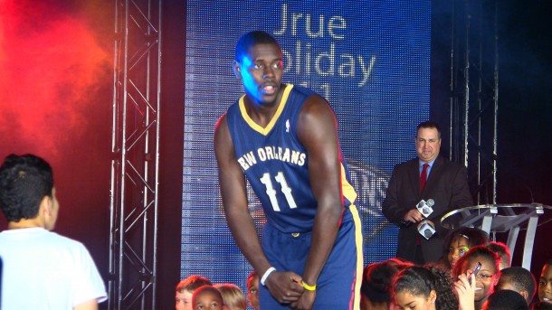
The New Orleans Pelicans unveiled their jerseys today at a press conference at Pelicans Practice Facility on Airline Drive. Forwards Jason Smith, Anthony Davis, and Ryan Anderson, were on hand to model the custom uniforms along with All-Star guard, Jrue Holiday. Children were in attendance, lining the runway the players used to model the uniforms, and participated in the Junior Training Camp following the press event.

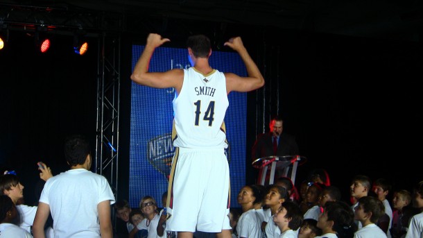
The long-awaited jerseys and short-awaited shorts, both home and away, were unveiled. Both sets feature “New Orleans” on the front in the team’s font and in an arc (I’d say a crescent, but there is no taper to the size), emphasizing the importance of the city and its culture, with the font being inspired by the wrought iron seen around the French Quarter and the rest of the city. The player number also appears on the front with player name and number on the back, as mandated by uniform guidelines.

The home uniforms are white, as is typical, and the road uniform are blue. A third uniform will be unveiled for next season along with a special jersey the following season. The Bird-de-lis logo appears on the back of the jersey above the name. The shorts feature the partial logo on the sides. The Pelicans also unveiled a new ligature “NO” logo that appears on the shorts on the waistband. This will appear on select merchandise. It is basically a basketball with a fancy “N” over the lines but within the “O” outline of the ball.

Here is a detailed schematic of the team’s identity: logos, uniforms, fonts, etc.


Other news:

Tom Benson likes the clean look of the logos.

Ryan Anderson says the rebrand has elevated the excitement of the players and fans.

Tom Benson reiterated the importance of the Pelicans Practice Facility, which is still under construction but is coming together. The court is in place.

He also reiterated the importance of the name to the state and the fans.

Davis has been working on his step-back jumper.

You can watch the press conference here.

You can order jerseys here. Order soon to get free shipping and a voucher for tickets. You can also purchase here.

Pelicans’ Press Release:

To continue to showcase a new identity that represents the culture and character of New Orleans and the Gulf Coast region, the New Orleans Pelicans unveiled their new home and road uniforms today. Dark Blue and Gold will be the prominent colors in the new uniforms, while the team’s third color, Red, will serve as an accent. The team’s home uniforms will be white, while the road jerseys will be dark blue.

The new Pelicans jerseys are available exclusively for pre-order beginning at 2:00 p.m. today at Pelicans.com. The first 500 pre-sold orders will include a voucher for two free tickets to one of the Pelicans’ first three home games of the 2013-14 regular season. Additionally, fans that purchase jerseys during the pre-sale will receive free shipping. Orders must be made by Sept. 15 and tickets are subject to availability.

“When we announced the Pelicans as the new name for the team, we were looking forward to days like today,” said Owner Tom Benson. “We love the look of the new uniforms and are especially proud to have New Orleans across the chest of all of our players who will be representing this great city and region. A year ago, we promised our fans we would build a championship-caliber team on and off the court – we promised a new brand that is representative of the Gulf South, investment in the product on the court, an improved arena to enhance the game-day experience and a new practice facility. Introducing our new uniforms is one more step in this exciting process.”

The Pelicans worked with designer Rodney Richardson to develop the adidas jerseys. The team also worked with Richardson to design the Pelicans’ logos. The word mark on both the home and road uniforms is inspired by French Quarter street signs. The uniforms will feature “New Orleans” on the front of both the home and road jerseys, making the Pelicans one of three teams in the NBA to wear its city’s name on the front of both jerseys.

The Pelicans’ partial logo is featured on the side of the shorts, while the “Bird-de-Lis” will be highlighted in the center back of the neck of the jersey. At the center of the waistband of the shorts sits a unique ligature that combines the letters ‘N’ and ‘O’ to form a basketball. This new mark, created specifically and exclusively for the Pelicans, will be used selectively by the team and incorporated into Pelicans’ branding.

“Today is a milestone day for Pelicans fans as we know they have been anxiously awaiting the unveiling of the new team uniforms,” said Owner/Vice Chairman of the Board Rita Benson LeBlanc. “The response to the Pelicans logos has been overwhelmingly positive and, with the season quickly approaching, we hope that as fans see the uniforms, they realize how every day we are working hard to bring them a first class experience. Every element of the Pelicans identity, from logos, uniform to the court design are all for our beloved and loyal fans.”

A full video of the uniform unveiling featuring Pelicans players Ryan Anderson, Anthony Davis, Jrue Holiday and Jason Smith can be viewed at Pelicans.com.

Uniform Facts from the Pelicans:

About the Uniforms

  • Dark Blue and Gold will be the prominent colors in the new uniforms, while the team’s third color, Red, will serve as an accent.
  • The team’s home uniforms will be white, while the road jerseys will be dark blue.
  • The Pelicans worked with designer Rodney Richardson to develop the adidas jerseys. The team also worked with Richardson to design the Pelicans’ logos.
  • The word mark on both the home and road uniforms is inspired by French Quarter street signs.
  • The uniforms will feature “New Orleans” on the front of both the home and road jerseys, making the Pelicans one of three teams in the NBA to wear its city’s name on the front of both jerseys.
  • The Pelicans’ partial logo is featured on the side of the shorts, while the “Bird-de-Lis” will be highlighted in the center back of the neck of the jersey.
  • At the center of the waistband of the shorts sits a unique ligature that combines the letters ‘N’ and ‘O’ to form a basketball. This new mark, created specifically and exclusively for the Pelicans, will be used selectively by the team and incorporated into Pelicans’ branding.

How They Stack Up

  • The Pelicans will be one of 10 teams with a dark blue uniform.
  • The dual-colored numbers on the jersey are similar to over half the league that has a two-color
    number system (the rest of the league employs one color or a three-color combination).
  • The Pelicans are one of three teams to use their city name on all of their uniforms (the Knicks
    and Nets the other two). Additionally, only 3 teams use only their nickname (Sixers, Jazz and
    Lakers), the rest of the league uses a mixture.
  • The Pelicans join 10 other teams that have a traditional V-neck collar.

The Colors

  • The Pelicans’ colors are dark blue, gold and red.
  • The team’s primary color, dark blue, is taken from Louisiana’s state flag.
  • The Pelicans and Saints share the color gold, uniting the organizations, while celebrating the spirited life of New Orleans and its many celebrations (gold is also a commonly found color on the “crown” of the pelican).
  • Red represents fraternity and is indicative of the blood provision of the mother pelican and the vibrant color underneath the pelican’s throat. All three colors are found on the flag of the City of New Orleans.

Special thanks to Andrew Smith for covering the event and taking some great pictures.

IMG_9735 IMG_9738 IMG_9739 IMG_9740  IMG_9749IMG_9736

IMG_9733 IMG_9746


84 responses to “New Orleans Pelicans Uniforms Unveiled”

  1. Man I was really excited before the release then Jason Smith came out and I was like that’s it just way too plain for me but I like the navy blue but they really dropped the ball with the plain white look. Home = D Road = B

    • sohonyc25 Again with the Brooklyn comparisons.  Brooklyn has TIMELESS jerseys with STRONG fonts and CLASSIC piping/trim along the side.  We have WEAK font with LAME 1997ish “modern” piping along the sides that clashes with the rest of the feel of the uniforms.  Is it classic, retro, or modern?

      • Roger.That. sohonyc25 Brooklyn can use black. That is unique in and of itself. You can be boring when you have a color nobody else is allowed to use

  2. I’m usually not one to complain, but I’d like the jerseys a lot better if the font size for New Orleans was a bit bigger.  The side designs on the shorts are really nice, but the numbers drown out the name of the city on the jerseys themselves.  To me this shortcoming is more noticeable on the away blues than the home whites.  I really loved the pelicans logo and the designs they released upon announcing the rebrand, but these jerseys? … not so much.  All that said, though, it’ll probably grow on me over time, especially once we start winning ball games.

  3. First of all I think these are pretty generic and forgettable, not bad but not good. 
    Second, what’s up with, what appears to be, the Buddhist 8 fold path symbol on the front of the shorts?
    Third, the New Orleans is way too small.

    Fourth, where is the giant pelican that should be on the front? I love the new name but they should totally have gone with the goofy. 
    Fifth, instead of a pelican on the front i have a weirder suggestion. Take a picture of each player wearing a pelican beak mask, they must exist, and stick it on the front of the jersey. It would be super weird

    • Dave371the New Orleans is way too small. 
      That was exactly my first thought.
      Also, Jrue in the dark blue uniform looks too much like the purple Lakers uniforms.

      • Black and white is way more hip. Name is bigger on the front, strong and bold. Court atleast has some texture in the wood. Difference between simple and down right boring! New Olreans is the most eccentric city in US. Show a little soul, funk!

      • DruProductions Asher504 I hate seeing people compare these Pelicans uniforms to the Brooklyn Nets.  We are nowhere in the same LEAGUE of style and class as the Nets.  If you don’t get that than you just don’t know a thing about fashion.

    • Asher504 Well, they could have been so busy that they looked like costumes.  Maybe the plan is to bore the opposing teams to death and then win by default…

  4. Old man Benson had to choose these designs.Rita why you didn’t stop him.Old people like they know whats hip.

    • Papa Pelican We’d have been so much better off with Seymour D Fair and his awesome retro World Fair colors.  I hate our “fierce Pelican with the demonic eyes” logo that is beyond cliched.

  5. I’ll just say with a name like The Pelicans, can we really afford to wear uniforms like these? Where is the culture, where is our identity?

  6. I agree with all the comments to date…same feeling I got upon the unveiling on the court…heard from my rep today that the court really looks good in person, and later, that Jrue came in their area to show them the jersey (road) and that it was sharp in person. Also saw the $350 on the website and almost fell out!

      • Pelican Poster DruProductions I saw the court and it looks great seeing the logo and colors on the hardwood, but that’s a cool idea having hardwood floors in the office.

      • DruProductions Pelican Poster Even cooler if you can get the “musical theme” contest going on here for the new players after they score…Doc approved and said you were the man to handle it! I’m still not happy with Anderson’s theme…and don’t want them to screw these up!

      • Pelican Poster DruProductions I heard this as well while at the unveiling. Really cool idea.

      • NOH Domination DruProductions Pelican Poster Sorry Dru I meant “Trew”…Doc said HE was the one to set this theme question up on the site for us to be the ones to decide for the new guys.  I just think they missed the boat on Anderson’s theme, After he scores I’d like to see the screen show Agent Smith (Matrix) saying “Mr. Anderson” or if Ryno goes on a tear and a time out is called after he hits another trey, Agent Smith saying, “why, why, why do you persist Mr. Anderson!”

  7. I like them.  Only thing I would change is make “New Orleans” bigger than the number.  Classy.  The stripe down the side is nice, and I LOVE the Bird-de-lis above the name on back.  
    The font for the number is tight.
    Looking forward to primary red/primary gold alternates next season.
    BTW, the prices for these are insane!

  8. The grandiose presentation of the uniforms made the actual unis look plain and boring; combine that with players awkwardly walking the catwalk and the the long awaited apparel looked boring. However, after I gave them some time to grow on me, they look clean, professional and well accented. Could be little better, could be a lot worse.
    The best part of the press conference, though, was seeing Jrue Holiday’s personality. I have no doubt that he’ll boost morale in the locker room while endearing himself to fans.

  9. Yeah….a little too generic…. I agree that the lettering is pretty small and it should have been larger. I understand they want to go more French Quarter-ish, but I really don’t think that is close being one of them street signs. The numbers are perfect. Hopefully we see a GOLD alternate in 2014 and possibly a Mardi Gras colorway in 2015. B/R gave the jersey’s a C-, but then again the majority of the people complaining are outsiders who don’t get the concept.

  10. How bad is this: I just clicked to preorder the jersey on the pelicans site and when I started scrolling through the options, got a shock when I saw Gordon’s jersey available. It wasn’t his jersey being available to buy that shocked me – I kind of just forgot he still played for us.

    • spatching3 I guess they didn’t want to risk having him out there today on stage with a frowny face…”yes I love these jerseys” (frown).

      • spatching3 Is kind of weird…your max player not being one of the guys…I think they are teaching him a bit of a lesson…get on board or get the h*** out!

      • It’s a shame we spend all this money on the guy and he does absolutely nothing to earn it in the first year, here’s hoping he’s worth 54M over 3 years instead…

      • spatching3 Did you spend a year in Tibet, forgetting that he’s wasted two years of his contract and 28M dollars?  🙂

      • First year he was still on his rookie deal. Last season was the first of his 4/54M contract. We gave him that contract after his extremely impressive first year with us, scoring over 180 points in 9 whole games. Remember?

  11. To go from the creole blue Hornet uniforms to this. . . ugh.  These uniforms are pretty weak, but in the end, I don’t care what they wear as long as they tear it up on the court.
    Seriously though, the uniforms bum me out a little.

  12. Also, did they mention if the “special jersey” TBA will be a new version of the Mardi Gras jerseys?

  13. At first when I just saw 2 pics of Jason Smith and Ryno, I wasn’t a fan at all of the new uni’s.  Then when I came on here I saw more picks and the reasoning behind alot of what went into the jersey: I REALLY LIKE IT A LOT!
    The word mark on both the home and road uniforms is inspired by French Quarter street signs.
    The Pelicans’ partial logo is featured on the side of the shorts, while the “Bird-de-Lis” will be highlighted in the center back of the neck of the jersey.
    At the center of the waistband of the shorts sits a unique ligature that combines the letters ‘N’ and ‘O’ to form a basketball. This new mark, created specifically and exclusively for the Pelicans, will be used selectively by the team and incorporated into Pelicans’ branding.
    On a side note, why can’t I register for this site???

  14. I like the colors. I dislike the v-neck design. They make the uniforms look like alien space suits. The gold outline on the neck, and not the shoulder contributes to that also. I dislike the entire design on the sides, especially the partial logo. They could have done a lot better with that.I really feel like they missed out on opportunity to make something really marketable. I think an accurate barometer for a good NBA jersey is whether or not they are embraced by the hip hop culture. They look too UFOish to be seen on rap videos.

    • lsucpolk If I’m not mistaken Wayne wore leopard print skinny jeans and Gucci Mane has an Ice Cream Cone tattooed on the side of his face. I’m a big hip hop fan but I don’t think that Hip Hop = Good Style all of the time.
      If the team is a winning team then you’ll see the jerseys everywhere….even in music videos.

      • DruProductions lsucpolk  They could have made something that at the very least, New Orleans rappers could embrace.  To make it marketable, you have to make it look good both on tv, and with a pair of jeans.  The Knicks, Celtics, Nets, Bucks, 76ers, Trailblazers, Jazz, and even OKC all have jerseys that do that.  The Pelicans Jerseys may look alright on the court, but I don’t see people wearing these outside of the New Orleans arena.  Hopefully, I am wrong.

      • lsucpolk I feel that if a team starts winning the uniform could be pink with green hearts everywhere people would still wear them because the team signifies winning.

      • 1st off Lil Wayne and Gucci mane are gangster rappers, the represent rap not hip hop. Anything commercial is rap, anything revolved around culture is hip hop. Mos Def is hip hop. See the difference?

      • yaboytonez Also anything commercial is popular which means it sells. I disagree that anything commercial is rap. Is J.Cole not hip hop? Nas? Kendrick Lamar? They’re all commercial, all have sponsorships, and get radio play. Rap culture and Hip Hop culture (as far as appearance) to me seems to be all about unique personality/style aka”swag” and both do not have a real difference as far as style. The only thing that separates them seems to be the meaning for song not the artist or what they wear. For example J.Cole has jumped back and forth many times from Gangster rap to meaningful hip hop in Cold World and Born Sinner.

      • I respect that. I guess I would just stress that hip hop is considered a lifestyle while rap is a genre of that lifestyle. Anything those rappers you mentioned endorse is indicative of that genre not the entire culture. Nas and Lupe are hip hop to me because they span the many genres of hip hop while people like Lil Wayne and Gucci Mane are pigeon holed as gansta rappers.

      • Regardless I respect the difference in opinions all the same. At the end of the day my team ain’t won jack but I want to support them. Not with these jerseys though lol I like the hats and t-shirts so I’ll do those.

    • lsucpolk The side piping is HORRIBLE.  Worst part of the whole outfit.  If you’re going “retro” and “simple” than DON’T MESS IT UP WITH A 1998 BUFFALO BILLS INSPIRED CRAPTASTIC PIPING THAT DOESN’T FIT.  
      Jesus I hate these f’ing things so much.

    • I really like the font of the numbers, and the small ‘New Orleans’ print doesn’t bother me so much.  I love how they made blue and gold prominent, and made red less so.  I hope the third jerseys are gold.   The v-neck, the outline on the v-neck and the lack on the shoulder, and the entire design sides are my criticisms.

  15. I really dislike them.  All things considered I wish we had just stayed the Pelicans with our unique colors, an NBA identity, lots of fun uniforms, etc. etc.  Maybe my feelings will change during the season but I just absolutely hate these boring-ass uniforms.  Worst in the NBA IMO.

  16. My enthusiasm for the off-season moves was not matched by the reveal of these uniforms. I understand blue,red and gold representing Louisiana, but it is boring and reading New Orleans (one of the most colorful cities in the world), it definitely falls flat.  This uniform could have been clean and modern but this design will not make people “gotta have it”.  I’m a fan and will cheer this team on, but it won’t be wearing either of these jerseys. Hopefully 2014 will take the Pelicans brain trust back to the drawing board.  But for right now, caps and t-shirts for this Pelicans fan.

  17. Why is everyone so surprised by the blandness of the jerseys? Have you not seen a Saints uniform? They are just as boring but, a Super Bowl/NBA championship makes you forget about that stuff real quick. Lets just win some games!

    • The Saints uniforms are not bland. The colors alone make them look nice. The Saints have 1 ring in 40 plus years. Your logic would make sense if we won at least a ring a decade.

      • yaboytonez I was more or less talking about the NIKE rebrand and yes the are very bland and boring when comparing them to a jersey such as Seattle’s. It’s a white jersey with a black number…what makes theirs anymore exciting than the pelicans?

      • If you want to make extreme comparisons like that then I will have to concede my point. The Seahawks have a design and color scheme like no other team in the entire league.

  18. After allowing it to simmer, and taking another look, these unis could be better, and could be a lot worse. I give them a B-.

  19. I’ve been regularly following this website for more than a year now, and this is the highest number of comments I’ve ever seen for a single story. And I’m assuming 90+% of the people commenting are men. What has our world come to when so many male fans care about the appearance of the team’s friggin’ uniforms? They’re just shirts and shorts with names and numbers on them, for God’s sake. What are we, judges on “Project Runway”? Maybe there’s nothing else to talk about until pre-season games begin, but we’ve got to try to come up with SOMETHING else. How about: Which starting center can we get in a trade for Eric Gordon?

    • What does the sex of a person have to do with this topic? You saying I’m a female because I go to games and wanted to wear a jersey to show support but won’t because the product ain’t worth the price? What are you talking about?

  20. Mr. Benson is trying to re-brand this team. He is trying to sell us on the roster potential, cheaper seating at the venue, new team name, a renovated arena, a new practice facility & new uniforms. Since he wants US to buy in and get behind these changes it is only natural for us to comment on what we like and dislike.

  21. I’m just glad this distraction is over. 
    This is a perfectly neutral jersey set that, like all jerseys, can be improved, at least until you get some emotional attachment to them . . . then they are perfect, of course.
    The NBA mandates 2 years to rebrand normally, and this was rushed by comparison. They also don’t have decades of tradition to draw own.
    I’ll be buying one as soon as I can buy a custom one, and I’ll not look back. I support the team, and, frankly, the team does a decent job of making me believe they support me. There’s really not much more we can ask when we were clinging on for NBA life just over a year ago for so long. 
    They bought into an imperfect franchise in an imperfect market with an imperfect fanbase. I’m fine with an imperfect handling of these details since we have so many years to tweak this and get right.

      • yaboytonez  Speaking as someone living in Oklahoma, the Thunder have a great fanbase.  You see jerseys/t-shirts EVERYWHERE!  Even banners on buildings supporting the team.  
        I hope ours gets even better.

      • yaboytonez That’s the reason they’re so successful and Durant keeps wanting to stay.

        TAKE NOTE!

  22. God help us if the men in this country ever have to fight another ground war or, even worse, are forced to defend our homeland.  I can see it now:  “How does my helmet look, Captain?”  Yeah, they died, but they looked good doing it.

    • yaboytonez I think a healthy Oden compliments Davis EXTREMELY well in the front court.  If he remains healthy, we’d have a very talented starting 5.

      • I agree, especially since Davis is showing he can shoot more oft than not nowadays. Oden can be the physical force on the inside.

  23. When you look at the design sheet for the jerseys and see all the features, they look pretty nice.  But seeing them on the players make them look dull because some of the features are hidden.  All in all, I will scoop one.  The away jersey is nice!!!!!!!

  24. Much like the rebranded name, the more I’ve looked closely at them the more I am fine with them.  Some of the coloring and neat stuff were done modestly and don’t stand out from afar.  That may be a reason for disliking them or simply the unluck of the draw given the color scheme.  I have a feeling that we may see some font size or layout change in the not too distant future…as it can be perfectly timed with the release of the newer jerseys each of the next two years.  As someone has stated before, I expect the next one to be gold, with blue accents, and a little red.  The following year we go Mardi Gras again in a way that is similar yet different than the ones we have before which I thought were great.  I simply don’t see us going red-ish as that just does not connect with our hometown professional, college, or governmental colors.  Alabama, Arkansas, and Indiana/Ohio maybe, but not down here.  I’d buy one if I had the dough, but for $350 I can upgrade my seats!

Leave a Reply

Your email address will not be published.