Our Pelicans writers discuss the recently unveiled logos, colors, and what we’ll miss about being the Hornets.
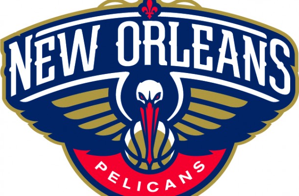
1. What are your thoughts on the primary logo?
Chris Trew: Love. It. It’s pretty busy but in a good way. The pelican looks about as “bout it, bout it” as it could while not being all phony.
Michael McNamara: Not my favorite of all the one’s I have seen, but I give it a solid 8. It looks a little too similar to the Atlanta Hawks logo and there could be a few more “New Orleans-ian” things in it, but I love the fierce-ness of the Pelicans eyes and the font they chose for New Orleans Pelicans.
Jason Calmes: It’s interesting, and not what I expected.They packed a ton in. New Orleans is way larger than Pelicans, which does a few things, including making them the opposite of the Lakers. A fleur-de-lis is in there at the top, and if you ignore the wings, the whole things looks like a fleur-de-lis. The scroll work at the top is also nice. The colors work. I always said gold had to be in the logo for a number of reasons, and it makes sense for this to be a Saints-like old gold. It’s a classy logo.
Andrew Smith: I like it, I wasn’t blown away by it at first but I can live with it. I think I would have loved it more if I haven’t seen some of the incredible logos that fans made because I expected the real one to blow the fan made ones out of the water, but the white crescent inside of the basketball is a nice touch, overall I like it even though I think it looks like the bentley logo.
Joe: Honestly I think it’s pretty bad-ass. It looks great on a hat, and the dark clue primary color looks great on apparel. It looks a bit like a law enforcement logo, which I approve.
2. Which is your favorite of the secondary logos?


CT: Crescent City Basketball is pretty great. I love alternative names for cities and we’ve got a couple of them down here. Crescent City Basketball just sounds so clean – and the logo feels the same way. If they slap those words on an alternate jersey I’ll be a happy Pels fan.
MM: I am a fan of the simple fleur de lis with the Pelican and basketball popping out. It condenses the features of the primary logo, keeping in everything I liked about it.
JC: I’ll go with Bird-de-Lis, but I wish they’d call it the Fleur-de-P. CCB is a close second. Really solid. The Nola one is fine, but the other two could be primaries, or at least the foundation for them.
AS: The Fleur-de-bird or Bird-de-lis whatever you want to call it it’s awesome. I was really excited to see how the Fleur-de-lis version of the logo would look & I’m very satisfied, it even made me like the primary logo more.
Joe: I actually like the Crescent Basketball, which is just the pelican and the ball from the main logo without any words. That thing looks like it’s taking that ball straight to Hell, and if you mess with him he’ll swallow you up and devour your soul.
3. Better colors– Hornets or Pelicans?
CT: Hornets colors are great. Pelican colors are greater. I know it’s similar to other teams but you’ve gotta trust the organization on this one – they are going so hard on the New Orleans connections that, as time passes, the Pelicans colors will feel more and more like it belongs to us.
If I were owner of the team I would have a gear swap where you can bring in your Hornet colored shoes, shirts and dresses and get them in navy, red and gold. Make it happen Lord Benson!
MM: If you asked the 10-year old version of me, he (or I?) would tell you that the Hornets colors are the best in the NBA. But as I have grown older, I have gravitated to darker, richer colors so I gotta go with the new one’s.
JC: The redone Hornets colors were nice, though I did not like that teal at all ever. I, however, like the Pelicans colors better. They are just more to my taste. I’m into flatter tones, and these are nice and flat. Good job.
AS: I can’t fully judge which colors I like better until I see the uniforms,court,etc… & how they use the color scheme in them, but I can compare how they’re used in the logos & if I put the Fleur-de-bee against the Fleur-de-bird Creole Blue & Gold wins hands down.
Joe: Creole blue is a sweet, sweet color. It’s unique to the Hornets and easily identifiable to anyone with a decent pair of eyes even if you’re hundreds of yards away. Still I prefer the new colors. They’re just more my style.
4. What will you miss most about being the Hornets?
CT: Hugo. And if the person inside of Hugo also has to be replaced then I’ll also miss whoever the person was inside of Hugo.
MM: Getting upset and bashing announcers, commentators, etc. when they call us (or the Bobcats) the Charlotte Hornets. It brought the community together when the national media disrespected us in such an overt way, and I will miss not having a reason to get angry at “The Man.”
JC: I’ve had some great times at Hornets games and met some great people. That word is part of the soundtrack and those logos, etc. are part of the set for them. It’s just be missed. Some want “Hornets” to fall into oblivion, at least around here. I embrace the memories, and am sad there will not be more. I’m also happy that I’ll start new with Pelicans memories. Giveth, taketh.
AS: Bee-Fense! I’m going to miss that chant since we may have to go to boring old “Defense” chants.
Joe: The word play. Bee-fense, buzz, sting, swatted, etc. Those words are gold for a sports writer looking to make his articles a bit more fun to read. The bird stuff will work too, but it won’t be unique.
5. What are you looking forward to most about being the Pelicans?
CT: A fresh start with 100% ownership of what might be the most unique brand in the entire league.
MM: Agreed- a fresh start, particularly away from the era of George Shinn. His stink still sticks to the Hornets name, but now there is a new identity that is truly New Orleans, with a New Orleans owner and a New Orleans name. Can’t wait to kick of the new era.
JC: Not having to talk about the rebrand (no offense, Joe). One less thing that isn’t talking about bouncing the ball. Pretty soon, we’ll be a normal team, if a team can be normal and in New Orleans. Normal will be nice for a little. Then, we’ll see what life deals us.
AS: “It will be a fresh start overall and we need that.”- Greivis Vasquez. I have to agree with Gravy, the fresh start that we will have is going to be a very refreshing feeling.
Joe: The added meaning that it gives to what was already one of my favorite birds. I’ve actually caught a Pelican (unintentionally) while fishing, and had to work my buns off to get it unhooked. Pelicans in general owe me one for that, and I’ld prefer to take that one in the form of a title.
2 responses to “Hornets Beat: On the Verge of Being Pelicans”
I will also miss Hugo.
And although Hornets are not Bees, I’ll miss the Bee-fense/sting/swarming defense wordplay.
I’ll even miss the teal, but the introducion of (real)Gold makes that transition much easier.
That being said….
FLY PELICANS!
[…] hot topic | January 28, 2013 | 0 Comments Hornets247 Hornets Beat: On the Verge of Being Pelicans Hornets247 It looks a little too similar to the Atlanta Hawks logo and there could be a few more “New Orleans-ian” things in it, but I love the fierce-ness of the Pelicans eyes and the font they chose for New Orleans Pelicans . Jason Calmes: It's interesting, and … …Source […]